A huge pet peeve we have over here is menu’s on mobile. 2020 taught us that people are finally learning how to use QR codes to access a restaurants menu. That’s great, but ONLY if your menu is actually readable and useful on mobile devices.
Physical menus have the ability to show the whole menu at once. People are used to holding a 12×6 plastic or paper menu and looking at both sides. That same menu scanned is ridiculously hard to use however.
Take a look at the menu below. If you are using a mobile phone, this menu will either be too small to read or require that you pan and zoom constantly to find that perfect meal. Sites that make reading the menu easy on a mobile device have a leg up.

Below is an example of a menu that is easy to read on mobile. This menu is easily browsed and viewed by anyone. No panning or zooming needed. Just a fast way to find the menu item you want to order.
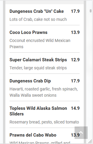
A few specific things to notice on this as well. There are no dot leaders. Those are the little dots from the item or description to the price.
Example: (item . . . . . . . . . . . .$1.00)
Those draw away from the description and help point out the price. Stay away from them.
Also, you might notice the prices do not have dollar signs or trailing zeros on the cents –
For example: $14.90 is 14.9. This is done to de-emphasize the fact that it is a dollar amount and help avoid thinking about the prices. Guys, there is an entire science to menu design and pricing. There is a great article at Webrestaurantstore.com on this.